EaSynth Look And Feel Customization - Buttons
Author: Xavier YOUNG (Xavier.YOUNG@easynth.com)
Date: 2008.09.20
Source: http://www.easynth.com
Introduction
EaSynth look and feel is an extended Synth look and feel, we can use it in our Java application for free. But the default theme in EaSynth look and feel may not always meet our requirements, sometimes we may want to custom the EaSynth look and feel.
As we may already know, the Synth look and feel does not provide a "default" theme, if we create an instance of javax.swing.plaf.synth.SynthLookAndFeel class (without loading any XML configuration file) and set it as the current look and feel in the UIManager, you will see an "empty" theme (shown in the figure below), which is not acceptable at all.
So before we use Synth look and feel in our products, we have to make proper configuration for all GUI component styles in an XML file and load it into the look and feel object. There are 50+ GUI components defined in swing, so creating a brand new look and feel from scratch is a little complex, but we can use EaSynth look and feel as a template and make customization on it, which also able to provide a brand new look and feel with less effort.
I will introduce the customization for different GUI components on EaSynth look and feel in a serial of articles, this article is the first one, which will introduce the customization on regular button in EaSynth look and feel.
We can customize the Synth based look and feel by changing its XML configuration file, painter class file and graphics utility class file. What's more, EaSynth look and feel provides some open properties, which allow us to custom the behavior of its painter and graphics utility.
EaSynth look and feel is built with a commercial IDE product "EaSynth Look And Feel Designer", the project file "EaSynthLookAndFeel.lfp" is also enclosed in the open source bundle. If you have the license, you can use that IDE to perform the customization, which will be a much easier job. But in these articles, I will focus on the way that performing customization without IDE tool.
Regular Button Customization
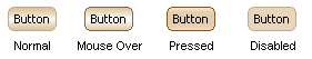
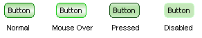
The following figure shows the four basic states of the regular button:
First we can change the background images of the button, they are specified in "easynth.xml" file, which is enclosed in the "com/easynth/lookandfeel" folder inside "EaSynthLookAndFeel.jar" file. Now let's open the "easynth.xml" file and locate the "style" node with id "Button", we will see the following:
<state value="ENABLED">
  <imagePainter method="buttonBackground" path="resource/1204727000093_button_enabled.png"
  sourceInsets="5 5 5 5" paintCenter="true" stretch="true"
  center="false"/>
</state>

<state value="MOUSE_OVER">
  <imagePainter method="buttonBackground" path="resource/1204727022828_button_mouseover.png"
  sourceInsets="5 5 5 5" paintCenter="true" stretch="true"
  center="false"/>
</state>

<state value="PRESSED">
  <imagePainter method="buttonBackground" path="resource/1204727039640_button_pressed.png"
  sourceInsets="5 5 5 5" paintCenter="true" stretch="true"
  center="false"/>
</state>

<state value="DISABLED">
  <imagePainter method="buttonBackground" path="resource/1204727048156_button_disabled.png"
  sourceInsets="5 5 5 5" paintCenter="true" stretch="true"
  center="false"/>
</state>
For each state, an imagePainter element is defined, the "method" attribute is set to "buttonBackground", means the imagePainter element is used to specify the background image for regular button. The "path" attribute present the location of the background image file. So the customization will be easy, we can just put some new images file into the "com\easynth\lookandfeel\resource" folder inside "EaSynthLookAndFeel.jar" file and then change the path attributes for imagePainter elements in the XML.
Here are my new background image files:
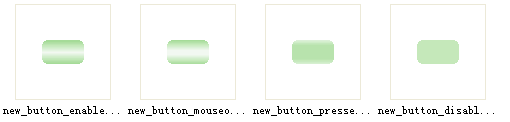
I put them into the JAR file and then modify the XML as follow:
<state value="ENABLED">
  <imagePainter method="buttonBackground" path="resource/new_button_enabled.png"
  sourceInsets="5 5 5 5" paintCenter="true" stretch="true"
  center="false"/>
</state>

<state value="MOUSE_OVER">
  <imagePainter method="buttonBackground" path="resource/new_button_mouseover.png"
  sourceInsets="5 5 5 5" paintCenter="true" stretch="true"
  center="false"/>
</state>

<state value="PRESSED">
  <imagePainter method="buttonBackground" path="resource/new_button_pressed.png"
  sourceInsets="5 5 5 5" paintCenter="true" stretch="true"
  center="false"/>
</state>

<state value="DISABLED">
  <imagePainter method="buttonBackground" path="resource/new_button_disabled.png"
  sourceInsets="5 5 5 5" paintCenter="true" stretch="true"
  center="false"/>
</state>
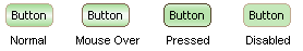
After update this XML to the JAR file, and applay the new look and feel JAR file in an example Java project, we can see the effect:
You will notice that the border of the button is not changed yet, but sometimes we need to change it as well. There are two open properties defined in EaSynth look and feel to define the dimension of the arc used in the border round corner:
- EaSynth.button.arc.width: the width of the ellipse that the arc comes from.
- EaSynth.button.arc.height: the height of the ellipse that the arc comes from.
The figure below shows that details for these two open properties:
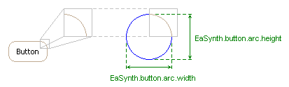
We can change the values of these properties in the XML, but keep in mind that the round corner of border should be consist with that of the background image:
<defaultsProperty key="EaSynth.button.arc.width" type="integer" value="9"/>
<defaultsProperty key="EaSynth.button.arc.height" type="integer" value="9"/>
We can also specify the border color for all states, there are another set of open properties defined to custom the border color, listed below:
<defaultsProperty key="EaSynth.button.border.color.enabled" type="idref" value="Button_Border_Color_Enabled"/>
<defaultsProperty key="EaSynth.button.border.color.mouseover" type="idref" value="Button_Border_Color_MouseOver"/>
<defaultsProperty key="EaSynth.button.border.color.pressed" type="idref" value="Button_Border_Color_Pressed"/>
<defaultsProperty key="EaSynth.button.border.color.disabled" type="idref" value="Button_Border_Color_Disabled"/>
<defaultsProperty key="EaSynth.button.border.color.default.enabled" type="idref" value="Button_Border_Color_Default_Enabled"/>
<defaultsProperty key="EaSynth.button.border.color.default.mouseover" type="idref" value="Button_Border_Color_Default_MouseOver"/>
<defaultsProperty key="EaSynth.button.border.color.default.pressed" type="idref" value="Button_Border_Color_Default_Pressed"/>
<defaultsProperty key="EaSynth.button.border.color.default.disabled" type="idref" value="Button_Border_Color_Default_Disabled"/>
The "type" attributes of these properties are set to "idref" means the value is linked to another object, and the id of that object is present in the "value" attribute. Let's search the id "Button_Border_Color_Enabled" in the XML and we will see this:
<object id="Button_Border_Color_Enabled" class="java.awt.Color">
  <int>192</int>
  <int>170</int>
  <int>145</int>
  <int>255</int>
</object>
Actually it is a Java bean object that persisted with XML format, the four integer parameter are Red, Green, Blue and Alpha value of the color, which can be 0~255. We can modify this Color object to change the border color for "Enabled" state, we can also change other Color objects to custom the border color for other states as well. The figure below shows the effect of my modification:
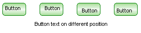
We can also change the "insets" element under the button style, this element can specify the margin of the button text:
<insets top="4" left="6" bottom="4" right="6"/>
By specifying different value for "top", "left", "bottom" and "right", we can place the button text on different position, just like these:
It is true that we can replace the "com.easynth.designer.laf.painter.EaSynthPainter" painter class used by EaSynth look and feel, to obtain the full flexibility to paint anything we need on the button, but this topic is out of the scope of this article. You can use the reference resource as the entrance to know more about that.
Arrow Button Customization
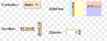
The arrow buttons are used in four kinds of components: JComboBox, JSplitPane, JScrollBar and JSpinner (see the figure bellow), if we custom the style for arrow button, all arrow buttons on these components will change as well.
We can find the arrow button style block in the "easynth.xml" file by searching the style with "Arrow Button" id:
	<!-- The style for arrow buttons. -->
	<style id="Arrow Button">
		<property key="ArrowButton.size" type="integer" value="9"/>
		<painter idref="EaSynthPainter" method="arrowButtonForeground" direction="north"/>
		<painter idref="EaSynthPainter" method="arrowButtonForeground" direction="west"/>
		<painter idref="EaSynthPainter" method="arrowButtonForeground" direction="south"/>
		<painter idref="EaSynthPainter" method="arrowButtonForeground" direction="east"/>
		<state value="ENABLED">
			<imageIcon id="Arrow_Up_Enabled" path="resource/1204972099671_arrow_up_normal.png"/>
			<property key="EaSynth.arrow.up.enabled" type="idref" value="Arrow_Up_Enabled"/>
			<imageIcon id="Arrow_Left_Enabled" path="resource/1204972109765_arrow_left_normal.png"/>
			<property key="EaSynth.arrow.left.enabled" type="idref" value="Arrow_Left_Enabled"/>
			<imageIcon id="Arrow_Down_Enabled" path="resource/1204972119562_arrow_down_normal.png"/>
			<property key="EaSynth.arrow.down.enabled" type="idref" value="Arrow_Down_Enabled"/>
			<imageIcon id="Arrow_Right_Enabled" path="resource/1204972131593_arrow_right_normal.png"/>
			<property key="EaSynth.arrow.right.enabled" type="idref" value="Arrow_Right_Enabled"/>
		</state>
		<state value="MOUSE_OVER">
			<imageIcon id="Arrow_Up_MouseOver" path="resource/1204972154296_arrow_up_over.png"/>
			<property key="EaSynth.arrow.up.mouseover" type="idref" value="Arrow_Up_MouseOver"/>
			<imageIcon id="Arrow_Left_MouseOver" path="resource/1204972172953_arrow_left_over.png"/>
			<property key="EaSynth.arrow.left.mouseover" type="idref" value="Arrow_Left_MouseOver"/>
			<imageIcon id="Arrow_Down_MouseOver" path="resource/1204972180796_arrow_down_over.png"/>
			<property key="EaSynth.arrow.down.mouseover" type="idref" value="Arrow_Down_MouseOver"/>
			<imageIcon id="Arrow_Right_MouseOver" path="resource/1204972188046_arrow_right_over.png"/>
			<property key="EaSynth.arrow.right.mouseover" type="idref" value="Arrow_Right_MouseOver"/>
		</state>
		<state value="PRESSED">
			<imageIcon id="Arrow_Up_Pressed" path="resource/1204972222593_arrow_up_press.png"/>
			<property key="EaSynth.arrow.up.pressed" type="idref" value="Arrow_Up_Pressed"/>
			<imageIcon id="Arrow_Left_Pressed" path="resource/1204972229812_arrow_left_press.png"/>
			<property key="EaSynth.arrow.left.pressed" type="idref" value="Arrow_Left_Pressed"/>
			<imageIcon id="Arrow_Down_Pressed" path="resource/1204972236828_arrow_down_press.png"/>
			<property key="EaSynth.arrow.down.pressed" type="idref" value="Arrow_Down_Pressed"/>
			<imageIcon id="Arrow_Right_Pressed" path="resource/1204972243953_arrow_right_press.png"/>
			<property key="EaSynth.arrow.right.pressed" type="idref" value="Arrow_Right_Pressed"/>
		</state>
		<state value="DISABLED">
			<imageIcon id="Arrow_Up_Disabled" path="resource/1204972279156_arrow_up_disable.png"/>
			<property key="EaSynth.arrow.up.disabled" type="idref" value="Arrow_Up_Disabled"/>
			<imageIcon id="Arrow_Left_Disabled" path="resource/1204972286015_arrow_left_disable.png"/>
			<property key="EaSynth.arrow.left.disabled" type="idref" value="Arrow_Left_Disabled"/>
			<imageIcon id="Arrow_Down_Disabled" path="resource/1204972293703_arrow_down_disable.png"/>
			<property key="EaSynth.arrow.down.disabled" type="idref" value="Arrow_Down_Disabled"/>
			<imageIcon id="Arrow_Right_Disabled" path="resource/1204972301171_arrow_right_disable.png"/>
			<property key="EaSynth.arrow.right.disabled" type="idref" value="Arrow_Right_Disabled"/>
		</state>
	</style>
	<bind style="Arrow Button" type="region" key="ArrowButton" />
The arrow button also have four states: ENABLED, MOUSE_OVER, PRESSED and DISABLED, just like the regular buttons. This style block firstly define the size of the arrow, this value should be consistent with the image to render the arrow:
<property key="ArrowButton.size" type="integer" value="9"/>
The "ArrowButton.size" property is not an EaSynth open property, it is a standard property provided by Synth look and feel. Then assign the EaSynthPainter object to the four painter elements for the paintings for different directions.
<object id="EaSynthPainter" class="com.easynth.designer.laf.painter.EaSynthPainter"></object>
......
<painter idref="EaSynthPainter" method="arrowButtonForeground" direction="north"/>
<painter idref="EaSynthPainter" method="arrowButtonForeground" direction="west"/>
<painter idref="EaSynthPainter" method="arrowButtonForeground" direction="south"/>
<painter idref="EaSynthPainter" method="arrowButtonForeground" direction="east"/>
Again we see a Java been persistance, it is an object of painter class that extended from "javax.swing.plaf.synth.SynthPainter". EaSynth look and feel use only one painter object for all the paintings, it is simpler but less flexible. Actually Synth look and feel allows using different painters for different paintings, just needing to assign different painter bean object to different painter element.
The painter elements set the "method" attribute to "arrowButtonForeground", means the calling of paintArrowButtonForeground() method defined in SynthPainter class will be delegated to the EaSynthPainter subclass. If we review the "EaSynthPainter.java" file, we will notice that the paintArrowButtonForeground() method in the EaSynthPainter class will load different icons to paint the arrow for different directions. It accepts the icons linked by the following properties:
EaSynth.arrow.up.enabled: the arrow icon for "up" direction, for ENABLED state;
EaSynth.arrow.left.enabled: the arrow icon for "left" direction, for ENABLED state;
EaSynth.arrow.down.enabled: the arrow icon for "down" direction, for ENABLED state;
EaSynth.arrow.right.enabled: the arrow icon for "right" direction, for ENABLED state;

EaSynth.arrow.up.mouseover: the arrow icon for "up" direction, for MOUSE_OVER state;
EaSynth.arrow.left.mouseover: the arrow icon for "left" direction, for MOUSE_OVER state;
EaSynth.arrow.down.mouseover: the arrow icon for "down" direction, for MOUSE_OVER state;
EaSynth.arrow.right.mouseover: the arrow icon for "right" direction, for MOUSE_OVER state;

EaSynth.arrow.up.pressed: the arrow icon for "up" direction, for PRESSED state;
EaSynth.arrow.left.pressed: the arrow icon for "left" direction, for PRESSED state;
EaSynth.arrow.down.pressed: the arrow icon for "down" direction, for PRESSED state;
EaSynth.arrow.right.pressed: the arrow icon for "right" direction, for PRESSED state;

EaSynth.arrow.up.disabled: the arrow icon for "up" direction, for DISABLED state;
EaSynth.arrow.left.disabled: the arrow icon for "left" direction, for DISABLED state;
EaSynth.arrow.down.disabled: the arrow icon for "down" direction, for DISABLED state;
EaSynth.arrow.right.disabled: the arrow icon for "right" direction, for DISABLED state;
So we can see the xml code to link an image to a property under each state in the arrow button style, the following piece of code is an example, it links a png image file to the "EaSynth.arrow.up.mouseover" property element, via the "Arrow_Up_MouseOver" id:
<imageIcon id="Arrow_Up_MouseOver" path="resource/1204972154296_arrow_up_over.png"/>
<property key="EaSynth.arrow.up.mouseover" type="idref" value="Arrow_Up_MouseOver"/>
So, by changing the specified image files, we can custom the arrow image, for different state, for different directions.
Checkbox Button Customization
There are four states defined for checkbox button in EaSynth look and feel, the states and their appearance are shown below:
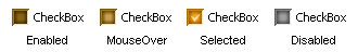
There is no any special open property used here to custom the checkbox style, EaSynth look and feel only use the "CheckBox.icon" property, which is defined in the Synth XML Format document. If we search the style with "Check Box" id, we will find these:
	<!-- The style for check box button. -->
	<style id="Check Box">
		<property key="CheckBox.margin" type="insets" value="2 2 2 2"/>
		<state value="ENABLED">
			<imageIcon id="Checkbox_Normal" path="resource/1204453247375_checkbox_normal.png"/>
			<property key="CheckBox.icon" type="idref" value="Checkbox_Normal"/>
		</state>
		<state value="MOUSE_OVER">
			<imageIcon id="Checkbox_MouseOver" path="resource/1204453256531_checkbox_mouseover.png"/>
			<property key="CheckBox.icon" type="idref" value="Checkbox_MouseOver"/>
		</state>
		<state value="SELECTED">
			<imageIcon id="Checkbox_Selected" path="resource/1204453267203_checkbox_selected.png"/>
			<property key="CheckBox.icon" type="idref" value="Checkbox_Selected"/>
		</state>
		<state value="DISABLED">
			<imageIcon id="Checkbox_Disabled" path="resource/1204122673828_checkbox_disabled.png"/>
			<property key="CheckBox.icon" type="idref" value="Checkbox_Disabled"/>
		</state>
	</style>
	<bind style="Check Box" type="region" key="CheckBox" />
The property element again uses "idref" type to link to an imageIcon element, which specifies an image file for the checkbox icon. So the customization for checkbox will be very easy: just replace those image files, we will then have a new look of the checkbox.
Radio Button Customization
There are five states defined for radio button in EaSynth look and feel, the states and their appearance are shown below:
Nothing surprise here, EaSynth look and feel use the "RadioButton.icon" typical property to define the icon for each state. The xml code to define the radio button looks like:
	<!-- The style for radio button. -->
	<style id="Radio Button">
		<property key="RadioButton.margin" type="insets" value="2 2 2 2"/>
		<state value="ENABLED">
			<imageIcon id="Radio_Button_Normal" path="resource/1204454221531_radio_enabled.png"/>
			<property key="RadioButton.icon" type="idref" value="Radio_Button_Normal"/>
		</state>
		<state value="MOUSE_OVER">
			<imageIcon id="Radio_Button_MouseOver" path="resource/1204454231234_radio_mouseover.png"/>
			<property key="RadioButton.icon" type="idref" value="Radio_Button_MouseOver"/>
		</state>
		<state value="PRESSED">
			<imageIcon id="Radio_Button_Pressed" path="resource/1204454241875_radio_pressed.png"/>
			<property key="RadioButton.icon" type="idref" value="Radio_Button_Pressed"/>
		</state>
		<state value="DISABLED">
			<imageIcon id="Radio_Button_Disabled" path="resource/1204121589843_radio_disabled.png"/>
			<property key="RadioButton.icon" type="idref" value="Radio_Button_Disabled"/>
		</state>
		<state value="SELECTED">
			<imageIcon id="Radio_Button_Selected" path="resource/1204454252156_radio_selected.png"/>
			<property key="RadioButton.icon" type="idref" value="Radio_Button_Selected"/>
		</state>
	</style>
	<bind style="Radio Button" type="region" key="RadioButton" />
So again it will be an easy job to custom the look of radio button: just change those image files.
Comparing with the checkbox button customization, we will find that the radio button has one more state: PRESSED. Can checkbox button also have a PRESSED state? The answer is positive. EaSynth look and feel omits the PRESSED state for checkbox button; it is just a decision for designing. We can custom the PRESSED state for checkbox button by adding a new state node with "PRESSED" value under the checkbox style node.
Toggle Button Customization
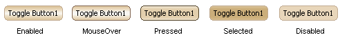
In EaSynth look and feel, the toggle button has almost the same look of regular button, except that it has one more customized state: SELECTED. The figure below shows its appearance:
Actually the way to custom the toggle button is almost the same with that for the regular button, except that we need to replace the painter method value from "buttonBackground" to "toggleButtonBackground" and from "buttonBorder" to "toggleButtonBorder". Here is the xml to custom the toggle button:
	<!-- The style for toggle button. -->
	<style id="Toggle Button">
		<insets top="4" left="6" bottom="4" right="6"/>
		<!-- Use the same border painter with regular button -->
		<painter idref="EaSynthPainter" method="toggleButtonBorder"/>
		<!-- This property will specify the arc with of the round border -->
		<defaultsProperty key="EaSynth.button.arc.width" type="integer" value="9"/>
		<!-- This property will specify the arc height of the round border -->
		<defaultsProperty key="EaSynth.button.arc.height" type="integer" value="9"/>
		<defaultsProperty key="EaSynth.button.border.color.enabled" type="idref" value="Button_Border_Color_Enabled"/>
		<defaultsProperty key="EaSynth.button.border.color.mouseover" type="idref" value="Button_Border_Color_MouseOver"/>
		<defaultsProperty key="EaSynth.button.border.color.pressed" type="idref" value="Button_Border_Color_Pressed"/>
		<defaultsProperty key="EaSynth.button.border.color.disabled" type="idref" value="Button_Border_Color_Disabled"/>
		<defaultsProperty key="EaSynth.button.border.color.default.enabled" type="idref" value="Button_Border_Color_Default_Enabled"/>
		<defaultsProperty key="EaSynth.button.border.color.default.mouseover" type="idref" value="Button_Border_Color_Default_MouseOver"/>
		<defaultsProperty key="EaSynth.button.border.color.default.pressed" type="idref" value="Button_Border_Color_Default_Pressed"/>
		<defaultsProperty key="EaSynth.button.border.color.default.disabled" type="idref" value="Button_Border_Color_Default_Disabled"/>
		<state value="ENABLED">
			<imagePainter method="toggleButtonBackground" path="resource/1204727000093_button_enabled.png" sourceInsets="5 5 5 5" paintCenter="true" stretch="true" center="false"/>		</state>
		<state value="MOUSE_OVER">
			<imagePainter method="toggleButtonBackground" path="resource/1204727022828_button_mouseover.png" sourceInsets="5 5 5 5" paintCenter="true" stretch="true" center="false"/>
		</state>
		<state value="PRESSED">
			<imagePainter method="toggleButtonBackground" path="resource/1204727039640_button_pressed.png" sourceInsets="5 5 5 5" paintCenter="true" stretch="true" center="false"/>
		</state>
		<state value="DISABLED">
			<imagePainter method="toggleButtonBackground" path="resource/1204727048156_button_disabled.png" sourceInsets="5 5 5 5" paintCenter="true" stretch="true" center="false"/>
		</state>
		<state value="SELECTED">
			<imagePainter method="toggleButtonBackground" path="resource/1204808843937_button_selected.png" sourceInsets="5 5 5 5" paintCenter="true" stretch="true" center="false"/>
		</state>
	</style>
	<bind style="Toggle Button" type="region" key="ToggleButton" />
We can see that the open properties that supported by regular button are also used here, and the configuration of these properties are completely the same, so that the toggle button will have the same look with the regular button, besides that it will have one more stable state: SELECTED.
Making the toggle button looks like a regular button is only a decision of EaSynth look and feel, when we custom the look and feel, we can have our own decision. We can replace the images, specify the insets, change border colors, and we can even use another painter object to obtain a brand new look for the toggle button.
Reference Resource
EaSynth Look And Feel Homepage: http://www.easynth.com/freewares/EaSynthLookAndFeel.html
Synth Look and Feel Introduction from SUN: http://java.sun.com/docs/books/tutorial/uiswing/lookandfeel/synth.html
Synth Look and Feel wiki: http://en.wikipedia.org/wiki/Synth_Look_and_Feel
Synth Look and Feel Javadoc: http://java.sun.com/javase/6/docs/api/javax/swing/plaf/synth/package-summary.html
Synth XML File Format: http://java.sun.com/javase/6/docs/api/javax/swing/plaf/synth/doc-files/synthFileFormat.html
Synth Component Specific Properties: http://java.sun.com/javase/6/docs/api/javax/swing/plaf/synth/doc-files/componentProperties.html
Synth Painter Javadoc: http://java.sun.com/javase/6/docs/api/javax/swing/plaf/synth/SynthPainter.html