Editing Component Styles with EaSynth Look And Feel Designer
Author: Xavier YOUNG (Xavier.YOUNG@easynth.com)
Date: 2008.03.30
Source: http://www.easynth.com
Introduction
As we already know, there are many UI components provided by Swing framework, and they all use the M-C-V model , which allow to change the appearance of the component. By editing the component styles, we can customize the whole Java theme (or let's say, Java look and feel), which make our software product much more exclusive.
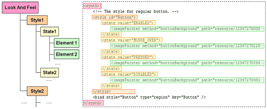
The Synth based Java look and feel consist of many styles that bind to different components. Each style has several states, correspond to the state of the component. Inside the state, there will be several elements to customize the appearance of the component in this state. This structure can be described as an XML file (like the following figure). You can read the Synth XML File Format for more details.
The component state can be one of the following or their combination:
- ENABLED
- MOUSE_OVER
- PRESSED
- DISABLED
- FOCUSED
- SELECTED
- DEFAULT
Not all components will support all states above. For example, a Panel only supports the states ENABLED and DISABLED state, if you customize other states for it, the additional customization will be ignored.
In EaSynth Look And Feel Designer, you can edit the content for each state of current style. If you don't know what states should be customized for specific component, we recommend you to use the look and feel template and fill in all states in all styles. In addition, you can use the enclosed "EaSynthLookAndFeel.lfp" project file as an example.
State Management
Once you select a style in the style tree, its states will be listed on the top of the style edit area. You can add or remove state for the current style by clicking the state manage button to popup context menu. Like this:
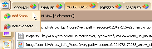
If you right click the state tab area, the context menu will popup, which allow you to move, edit or remove the selected state.
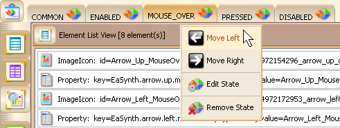
You can switch the current editing state by clicking the tab for the state, once you switch the state, all views will be updated to present the content of the current state.
You can add element into the current state of current style by clicking the corresponding wizard button.
There are 10 wizards provided on the right toolbar of the editor region. They correspond to the element types defined in Synth XML File Format.
Now let's go through these wizards one by one:
1. Bean Object Wizard
 |
This wizard can add or edit a bean persistence element. It is frequently used for adding the java object into the style, like painters, graphicsUtils, and color objects that referenced by painters etc. |
This wizard provides a GUI that looks like a property sheet. Each row contains two columns: the one on the left is the property name, the one on the right is the value. You can select the value to edit it.
Normally you can input your new value in the row directly, if the data type
is not string or number, you may need to click the  button to popup the editor for editing. If you want to remove the value, you
can press the
button to popup the editor for editing. If you want to remove the value, you
can press the  button.
To add bean persistence via this wizard, you should:
- Specify the class name
- Choose the constructor
- Fill in the parameters for constructor (will invoke another bean object wizard if the parameter is not primitive type)
- Set properties of the object if needed
- Specify the id for the object
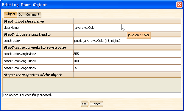
Once you finish all the steps above, you will get the message "The object is successfully created" on the button of the GUI, means the bean object is created. You should also specify the id of this element, which will be referenced latter.
2. Color Wizard
 |
This wizard can add or edit a color element. A color element can be one of the following types: FOREGROUND, BACKGROUND, TEXT_FOREGROUND, TEXT_BACKGROUND or FOCUS. |
The GUI of the color wizard is shown below:
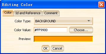
You need to specify the color type here, there are 5 available color types:
- FOREGROUND: the foreground color of the component
- BACKGROUND: the background color of the component
- TEXT_FOREGROUND: the text foreground color of the component
- TEXT_BACKGROUND: the text background color of the component
- FOCUS: the color for focused component
You can click the "Choose..." button to specify the color in popup color chooser dialog, or just input the color value in the "Color Value:" editing area. The preview box will show the current specified color.
3. Font Wizard
 |
This wizard can add or edit a font element. You need to specify the font name, font size and font style. |
Normally you should put a font element in the default style so that all components will have the same font for display. But you can also specify different font element for different component. The GUI of the font wizard is shown below:
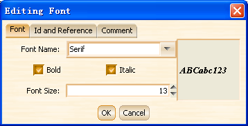
You can specify the font name, font size and font style in the window, you can preview the font in the preview area on the right side.
4. GraphicsUtils Wizard
 |
This wizard can add or edit a graphicsUtils element, which can define the line style for the Tree component. |
Before using this wizard, you should design a class that extended from javax.swing.plaf.synth.SynthGraphicsUtils class , and then use the Bean Object Wizard to create an instance of your graphicsUtils class, finally you can use the GraphicsUtils wizard to add graphicsUtils element, please remember to specify the id of the previous added graphicsUtils object.
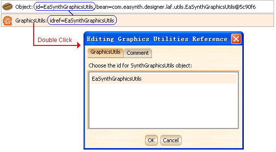
In the GUI of this wizard, you just need to select the bean object element, which is the instance of your graphicsUtils class. If there is no instance of SynGraphicsUtils defined in your look and feel project, the list in the GUI will be empty.
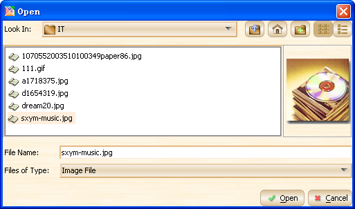
5. ImageIcon Wizard
 |
This wizard can add or edit an ImageIcon element. |
Its feature is similar with the bean object wizard but it is for image only. The selected image will be wrapped as an ImageIcon, which can be referenced as icon type property.
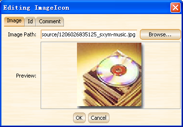
You can specify the image file in file chooser by clicking the "Browse..." button. On the left of the image file chooser, the image preview is provided.
Once you finish the file image choosing, the image preview is also provided on the wizard window. You should also specify the id of the ImageIcon element, so that it can be referenced latter.
6. ImagePainter Wizard
 |
This wizard can add or edit an ImagePainter element, which will be used to paint the component with the image. |
In this wizard, you need to specify the image for painting, and you need to specify which method will use the painter as well.
The method name here corresponds to the method name of a paint method in SynthPainter with the paint prefix dropped; the remainder is case insensitive (using the latin1 case folding rules). For example SynthPainter.paintButtonBackground is identified by 'buttonBackground' or 'buttonbackground'. If the method name is not specified, the painter is used for all methods that don't have a specific painter for them.
You can also specify the source insets and destination insets for scaling the image.
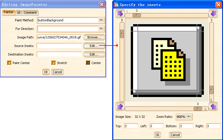
You can read the introduction of Synth look and feel to know more about the image scaling.
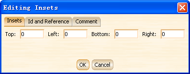
7. Insets Wizard
 |
This wizard can add or edit an Insets element. |
The insets specified in this wizard will be set on any components the style is associated with.
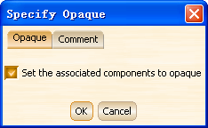
8. Opaque Wizard
 |
This wizard can add or edit an Opaque element. |
The opaque value will be set on any components the style is associated with. Please notice that the background color of the component will be ignored if the opaque value is set to false.
9. Painter Wizard
 |
This wizard can add or edit an Painter element. |
The Painter element is similar with the ImagePainter element but more general, you can write your own painter class to tell Synth how you want to paint the component.
Before using this wizard, you should design a class that extended from javax.swing.plaf.synth.SynthPainter, and then use the Bean Object Wizard to create an instance of your painter object, finally you can use this wizard to add Painter element, please remember to specify the id of the previous added painter object.
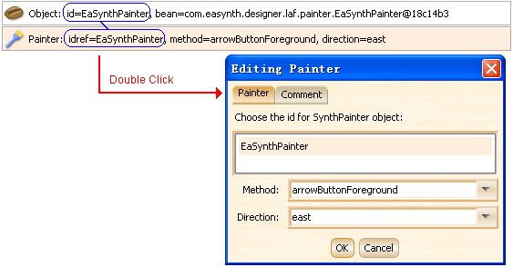
You also need to specify the method that will use the painter, the method name here corresponds to the method name of a paint method in SynthPainter with the paint prefix dropped; the remainder is case insensitive (using the latin1 case folding rules). For example SynthPainter.paintButtonBackground is identified by 'buttonBackground' or 'buttonbackground'. If the method name is not specified, the painter is used for all methods that don't have a specific painter for them.
10. Property Wizard
|
This wizard can add or edit a Property or DefaultsProperty element. |
These two kinds of elements have the same attributes: key, type and value.
Property elements are used to add key value pairs to a SynthStyle that can be
accessed by way of the get method. Many components use the key value pairs for
configuring their visual appearance; DefaultsProperty elements are used to define
properties that will be placed in the UIDefaults table that SynthLookAndFeel
supplies to the UIManager.
For the styles that associate with different components, the optional properties
in the list are different; you can put your mouse cursor on the property item
to see the description inside the tool tip.
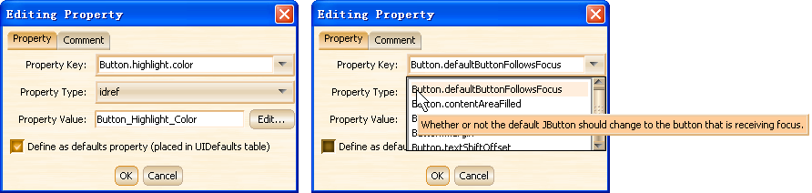
There are six property types supported:
- idref: The property value will be the id of element that defined before.
- boolean: The property value can be "true" or "false".
- dimension: The property value should have the format like "170 25" which correspond to "width height". You can click the "Edit..." button to popup the dimension editor window and fill up the values.
- insets: The property value should have the format like "10 20 15 25" which correspond to "top left bottom right". You can click the "Edit..." button to popup the insets editor window and fill up the values.
- integer: The property value should be an integer.
- string: The property value should be a string. This property type is supported from JRE6.
Checking the checkbox on the bottom will define the property as a DefaultsProperty element, otherwise the property will be defined as a Property element.
Editing in Element List View
The element list view will list all elements in the current state of the current
editing style. This view is opened by default when you launch the software,
you can close / reopen this view by clicking the  button.
This viw support multiple elements selection, you can press the SHIFT key to select a serial items, you can also press CTRL key and click the item to add it into your selection. This view also support CTRL+A hotkey to select all elements inside.
Inside this view, you can double click the element item to edit the element via the corresponding wizard. You can also right click the element item to popup the context menu, which allow you to manage the selected element(s).
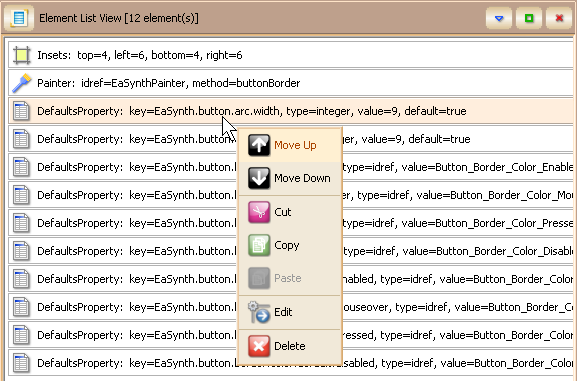
This view also support to move up / down the element via hotkeys:
- ALT + UP: Move the selected element(s) up.
- ALT + DOWN: Move the selected element(s) down.
You can also press the DELETE key to delete the selected element(s).
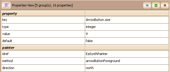
Editing in Properties View
The properties view can list all properties in each element. Each element will
be expanded as a "group", the attributes inside the element will be
listed as properties under the group. This view is opened by default when you
launch the software, you can close / reopen this view by clicking the  button.
With this view, you can view and edit all properties for each element, it is more suitable for advanced user, because the user need to know more about Synth look and feel to perform the modification on properties.